Ιστορίες χαρτών
Ανακαλύψτε εκτάσεις, προβολές και δεδομένα συνόρων και ελέγξτε τα στον χάρτη.
Άνοιγμα χάρτη →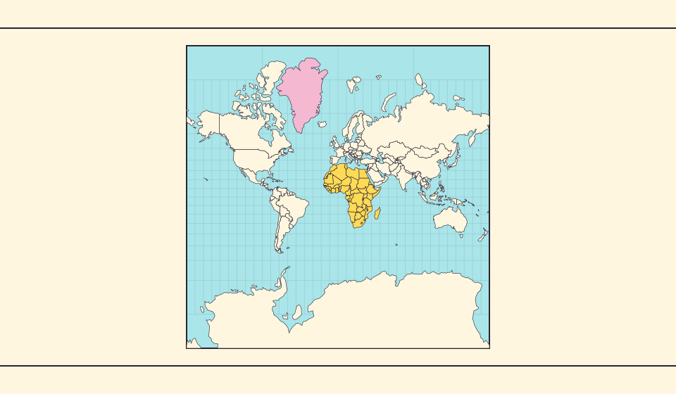
Γιατί η Γροιλανδία φαίνεται τόσο μεγάλη;
Οι χάρτες Μερκάτορα τεντώνουν περιοχές κοντά στους πόλους. Έτσι η Γροιλανδία φαίνεται υπερβολικά μεγάλη σε σχέση με χώρες στον ισημερινό. Συγκρίνετε Γροιλανδία και Αυστραλία στο Equal Earth. Ένας χάρτης χρήσιμος στην πλοήγηση δεν είναι πάντα καλός για σύγκριση εμβαδών.
Διαβάστε την ιστορία →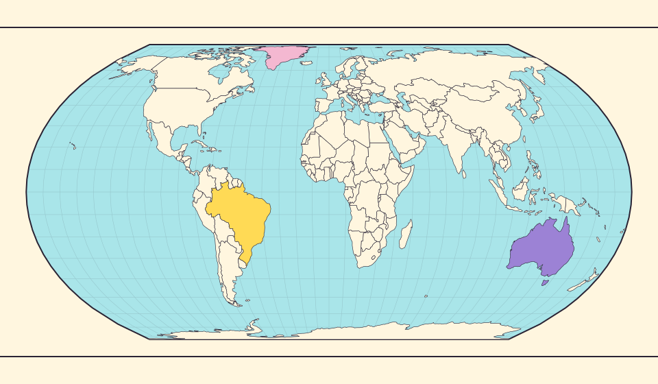
Τι διατηρεί το Equal Earth;
Η μεταφορά μιας σφαίρας σε επίπεδο αλλάζει κάποια χαρακτηριστικά. Το Equal Earth διατηρεί σχετικά εμβαδά, όχι όλα τα σχήματα, τις αποστάσεις και τις κατευθύνσεις. Στην άκρη της υδρογείου τα σχήματα συμπιέζονται. Επιλέξτε όψη ανάλογα με το ερώτημα.
Διαβάστε την ιστορία →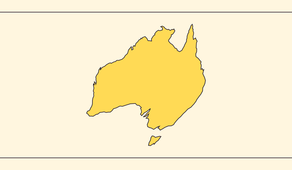
Γιατί διαφέρουν σύνορα και εμβαδά;
Η απλοποίηση παραλείπει μικρούς κόλπους και νησιά. Χρησιμοποιούμε όρια Natural Earth σε κλίμακα 1:110 εκατομμύρια και υπολογίζουμε εμβαδά από απλοποιημένα σφαιρικά σχήματα. Οι επίσημες τιμές ίσως μετρούν νερά και εδάφη διαφορετικά. ≈ σημαίνει εκτίμηση.
Διαβάστε την ιστορία →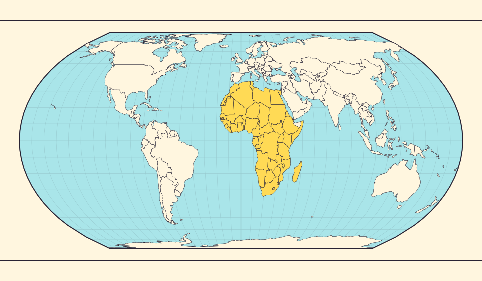
Africa is bigger than the map in your memory
The equator crosses Africa, but familiar rectangular maps give northern regions extra space. Compare Africa with countries you know to get a sense of its size.
Διαβάστε την ιστορία →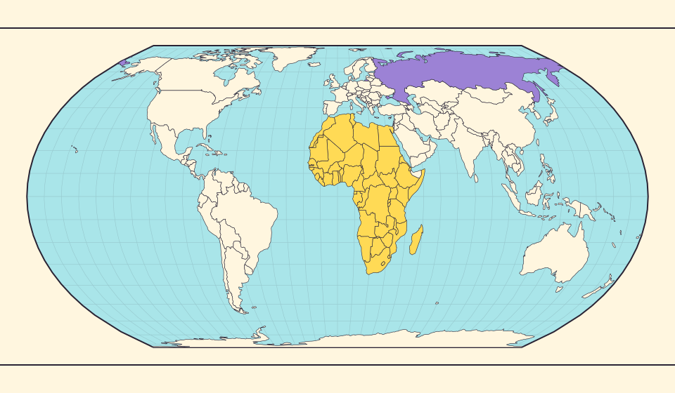
Russia and Africa: width is not area
Russia stretches across the top of many world maps. Compare that visual width with area, and learn why a country and a continent need different labels.
Διαβάστε την ιστορία →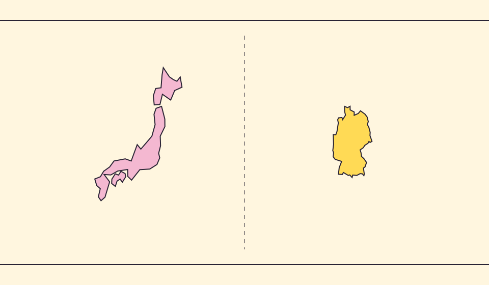
Japan and Germany: a long shape can hide a similar area
An island chain and a compact mainland country look very different. Compare area without confusing the sea between islands with land.
Διαβάστε την ιστορία →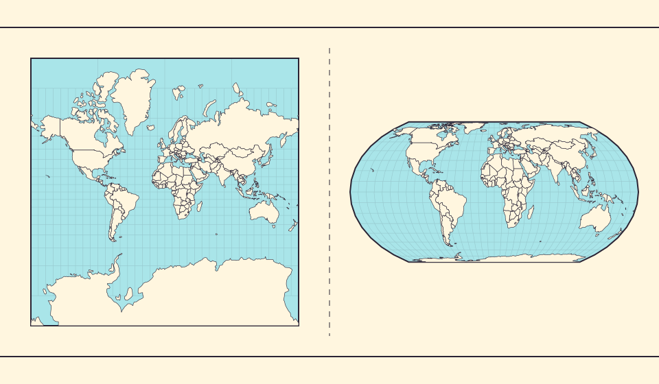
Why online maps stop before the poles
Square tiles make a world map easy to zoom, but Mercator cannot place the poles at a finite height. Learn what the missing polar strip means.
Διαβάστε την ιστορία →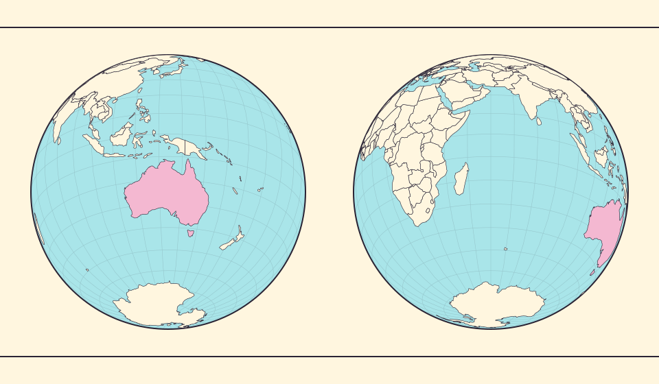
Why a country looks smaller at the globe’s edge
A globe avoids the familiar rectangular world, but its screen image still compresses the edge. Separate spherical area from visible footprint.
Διαβάστε την ιστορία →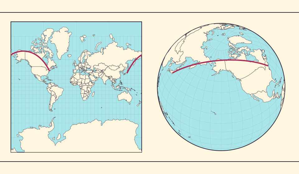
Why the shortest flight looks curved on a map
A straight line on the screen need not be the shortest path around Earth. Compare great-circle paths with compass bearings, and see what a route illustration can tell you.
Διαβάστε την ιστορία →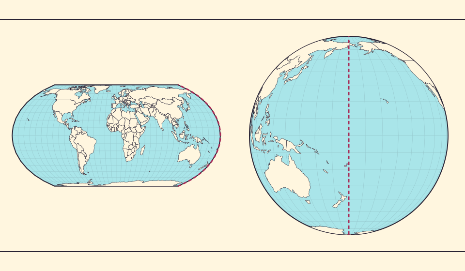
The map edge is not the International Date Line
Longitude wraps around, a flat map has a seam, and calendar dates have a boundary. These three ideas are related but not identical.
Διαβάστε την ιστορία →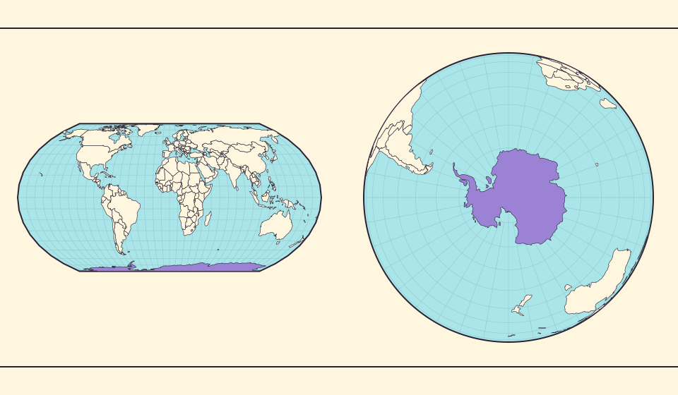
Antarctica is a continent, not the bottom border
A stretched southern strip can hide the shape of a whole continent. Compare Antarctica on Mercator, Equal Earth and a polar globe view.
Διαβάστε την ιστορία →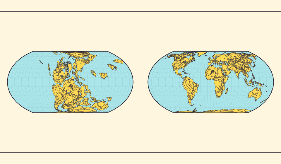
Pangaea was not there at the start of every timeline
At 600 million years ago, Pangaea had not yet assembled. Follow separated landmasses as they come together and later drift apart.
Διαβάστε την ιστορία →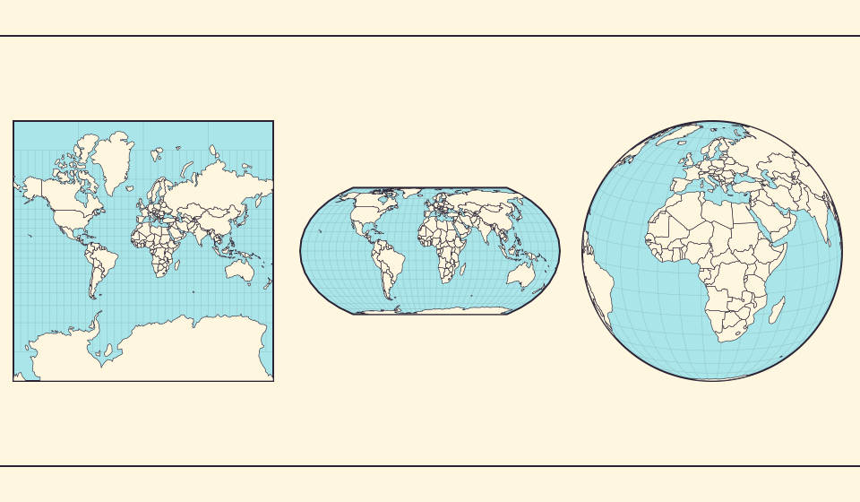
Five questions before sharing a “true world map”
Projection, zoom, viewpoint, source detail and the meaning of area all affect how you read a map. Check these before sharing a comparison screenshot.
Διαβάστε την ιστορία →