Opowieści o mapach
Poznaj powierzchnie, odwzorowania i dane granic, a potem sprawdź je na mapie.
Otwórz mapę →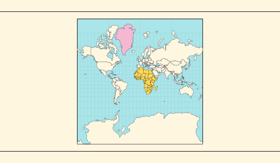
Dlaczego Grenlandia wygląda tak ogromnie?
Mapy Merkatora rozciągają obszary blisko biegunów. Grenlandia wygląda więc zbyt duża wobec krajów przy równiku. Porównaj Grenlandię i Australię na Equal Earth. Mapa przydatna do nawigacji nie musi nadawać się do porównywania powierzchni.
Przeczytaj opowieść →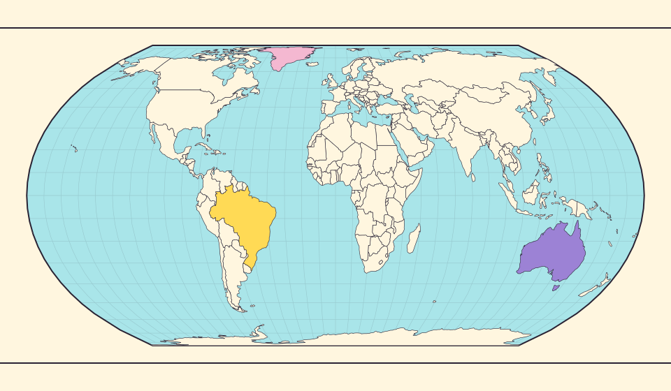
Co zachowuje Equal Earth?
Spłaszczenie kuli zmienia jej właściwości. Equal Earth zachowuje względne powierzchnie, ale nie wszystkie kształty, odległości i kierunki. Przy krawędzi globusu kształty się ściskają. Wybierz widok odpowiedni do pytania.
Przeczytaj opowieść →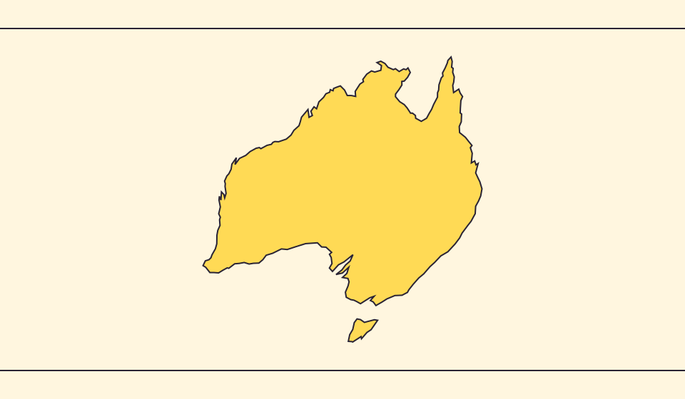
Dlaczego granice i powierzchnie się różnią?
Uproszczenie pomija małe zatoki i wyspy. Używamy granic Natural Earth w skali 1:110 milionów i obliczamy powierzchnie z uproszczonych kształtów sferycznych. Oficjalne dane mogą inaczej uwzględniać wody i terytoria. ≈ oznacza szacunek.
Przeczytaj opowieść →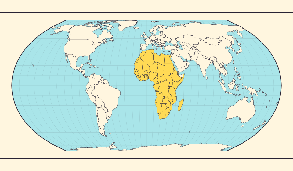
Africa is bigger than the map in your memory
The equator crosses Africa, but familiar rectangular maps give northern regions extra space. Compare Africa with countries you know to get a sense of its size.
Przeczytaj opowieść →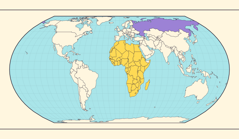
Russia and Africa: width is not area
Russia stretches across the top of many world maps. Compare that visual width with area, and learn why a country and a continent need different labels.
Przeczytaj opowieść →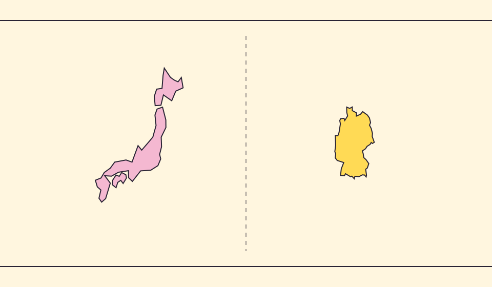
Japan and Germany: a long shape can hide a similar area
An island chain and a compact mainland country look very different. Compare area without confusing the sea between islands with land.
Przeczytaj opowieść →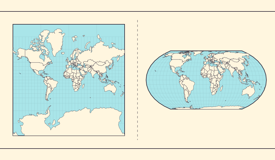
Why online maps stop before the poles
Square tiles make a world map easy to zoom, but Mercator cannot place the poles at a finite height. Learn what the missing polar strip means.
Przeczytaj opowieść →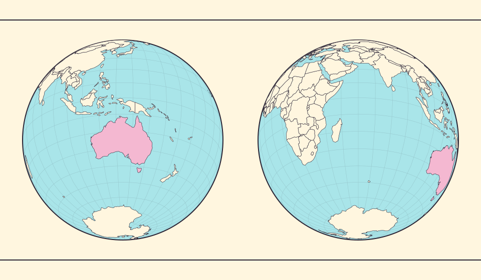
Why a country looks smaller at the globe’s edge
A globe avoids the familiar rectangular world, but its screen image still compresses the edge. Separate spherical area from visible footprint.
Przeczytaj opowieść →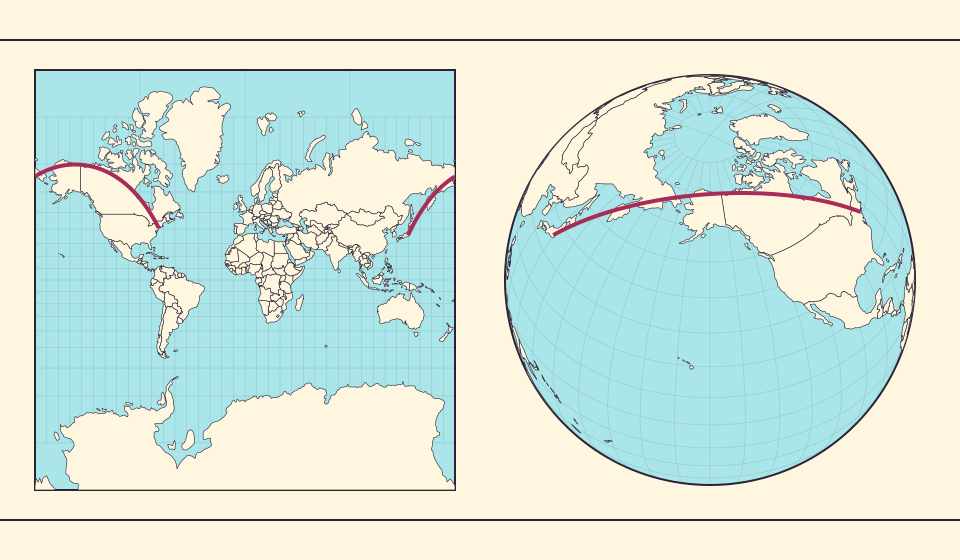
Why the shortest flight looks curved on a map
A straight line on the screen need not be the shortest path around Earth. Compare great-circle paths with compass bearings, and see what a route illustration can tell you.
Przeczytaj opowieść →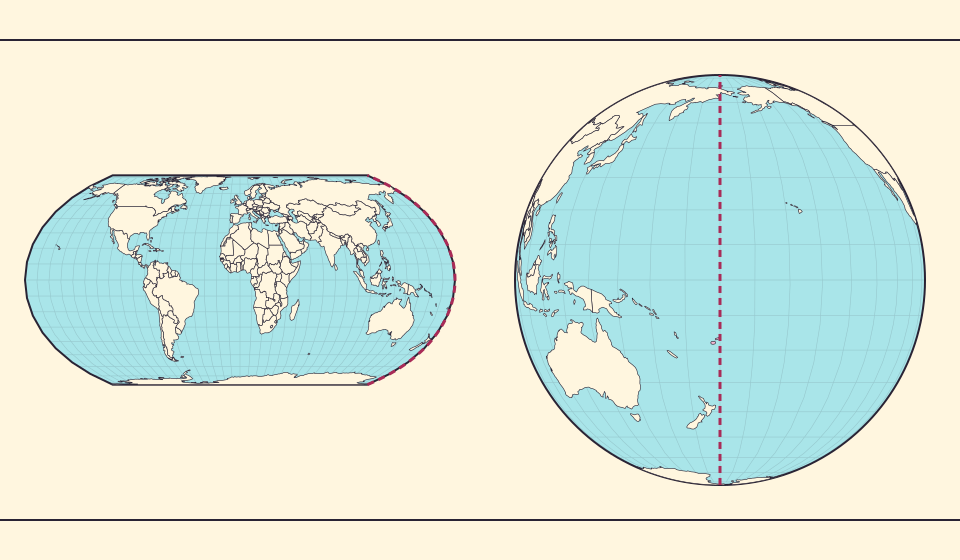
The map edge is not the International Date Line
Longitude wraps around, a flat map has a seam, and calendar dates have a boundary. These three ideas are related but not identical.
Przeczytaj opowieść →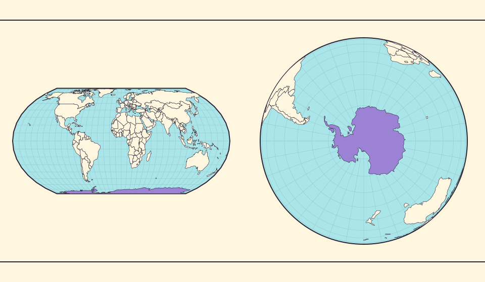
Antarctica is a continent, not the bottom border
A stretched southern strip can hide the shape of a whole continent. Compare Antarctica on Mercator, Equal Earth and a polar globe view.
Przeczytaj opowieść →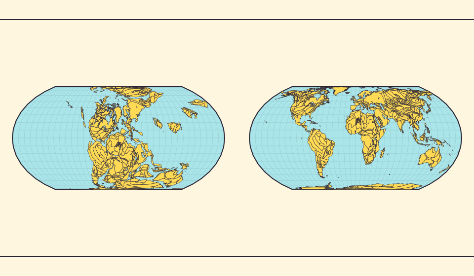
Pangaea was not there at the start of every timeline
At 600 million years ago, Pangaea had not yet assembled. Follow separated landmasses as they come together and later drift apart.
Przeczytaj opowieść →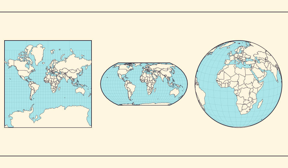
Five questions before sharing a “true world map”
Projection, zoom, viewpoint, source detail and the meaning of area all affect how you read a map. Check these before sharing a comparison screenshot.
Przeczytaj opowieść →