Historias de mapas
Explora superficies, proyecciones y datos de fronteras y compruébalos en el mapa.
Abrir mapa →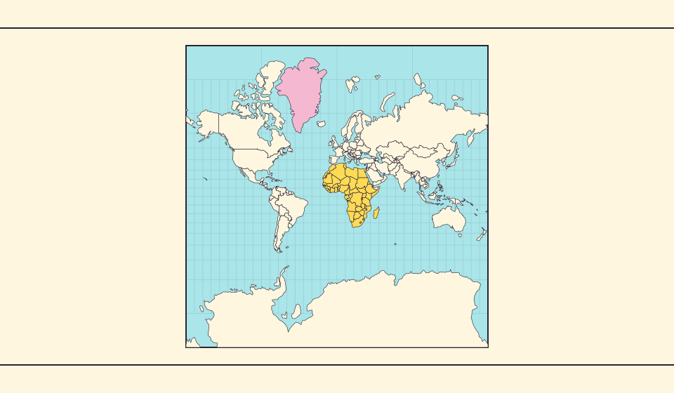
¿Por qué Groenlandia parece tan grande?
Los mapas de Mercator estiran las regiones cercanas a los polos. Groenlandia parece así demasiado grande frente a países del ecuador. Compara Groenlandia y Australia en Equal Earth. Un mapa útil para navegar no necesariamente sirve para comparar superficies.
Leer la historia →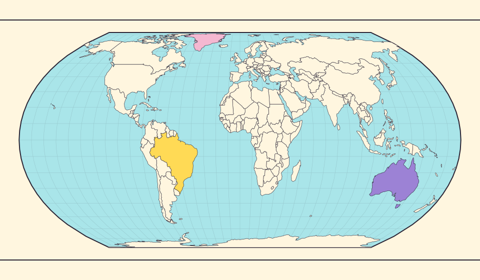
Lo que conserva Equal Earth
Aplanar una esfera cambia algunas propiedades. Equal Earth conserva las áreas relativas, pero no todas las formas, distancias y direcciones. En el borde del globo las formas se comprimen. Elige la vista según la pregunta que quieras responder.
Leer la historia →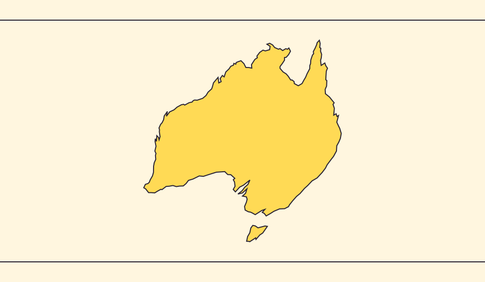
Por qué cambian fronteras y áreas
La simplificación omite pequeñas bahías e islas. Usamos límites de Natural Earth a escala 1:110 millones y calculamos áreas a partir de geometrías esféricas simplificadas. Las cifras oficiales pueden incluir agua y territorios de otra manera. ≈ señala una estimación.
Leer la historia →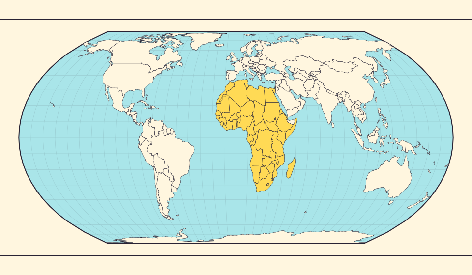
Africa is bigger than the map in your memory
The equator crosses Africa, but familiar rectangular maps give northern regions extra space. Compare Africa with countries you know to get a sense of its size.
Leer la historia →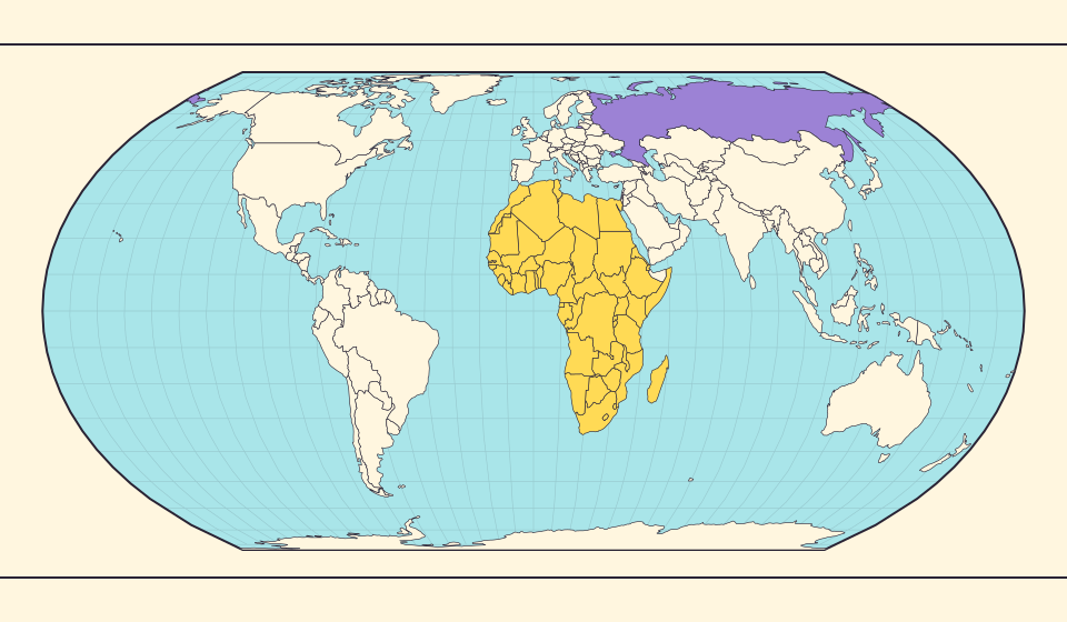
Russia and Africa: width is not area
Russia stretches across the top of many world maps. Compare that visual width with area, and learn why a country and a continent need different labels.
Leer la historia →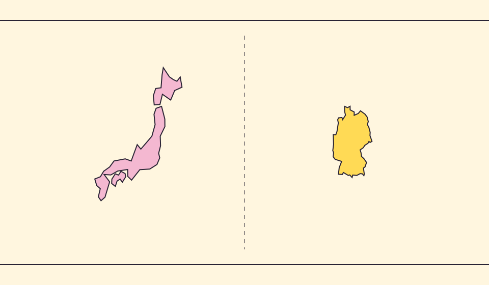
Japan and Germany: a long shape can hide a similar area
An island chain and a compact mainland country look very different. Compare area without confusing the sea between islands with land.
Leer la historia →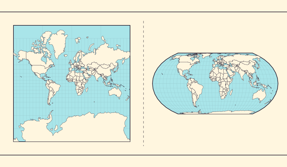
Why online maps stop before the poles
Square tiles make a world map easy to zoom, but Mercator cannot place the poles at a finite height. Learn what the missing polar strip means.
Leer la historia →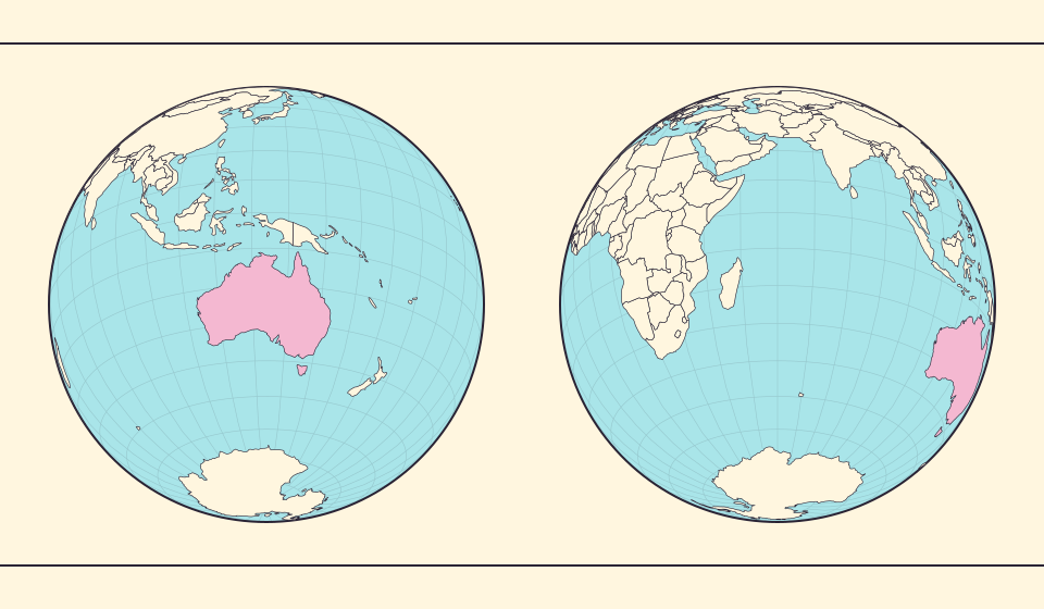
Why a country looks smaller at the globe’s edge
A globe avoids the familiar rectangular world, but its screen image still compresses the edge. Separate spherical area from visible footprint.
Leer la historia →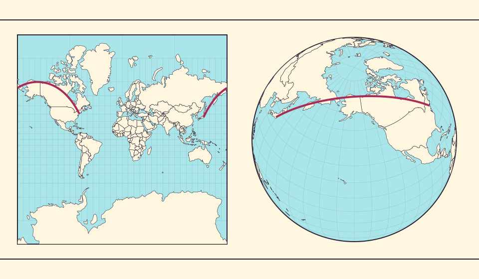
Why the shortest flight looks curved on a map
A straight line on the screen need not be the shortest path around Earth. Compare great-circle paths with compass bearings, and see what a route illustration can tell you.
Leer la historia →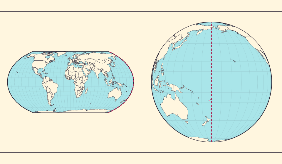
The map edge is not the International Date Line
Longitude wraps around, a flat map has a seam, and calendar dates have a boundary. These three ideas are related but not identical.
Leer la historia →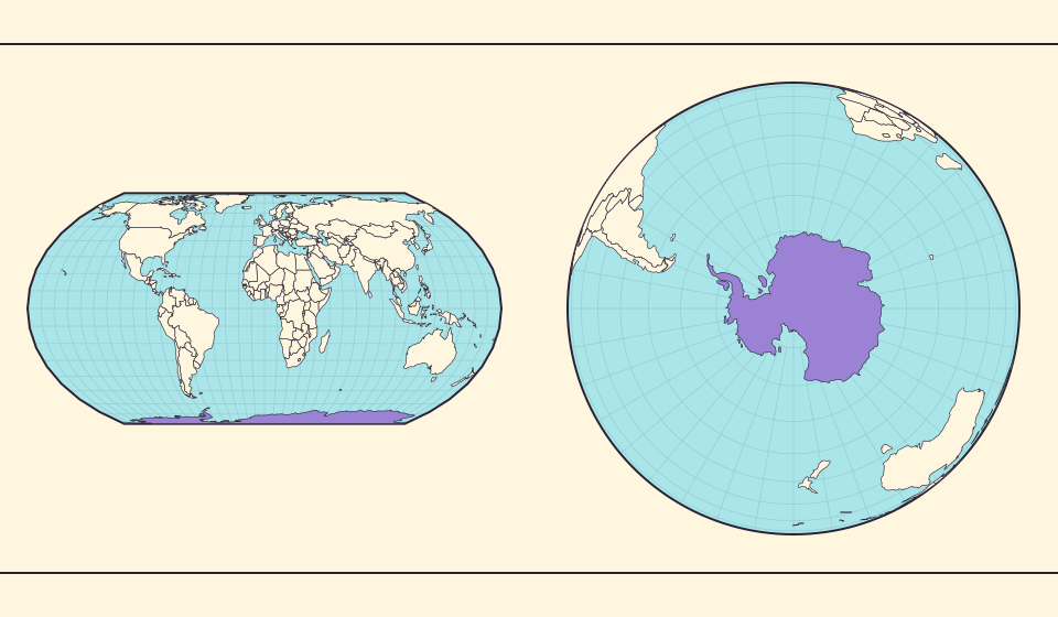
Antarctica is a continent, not the bottom border
A stretched southern strip can hide the shape of a whole continent. Compare Antarctica on Mercator, Equal Earth and a polar globe view.
Leer la historia →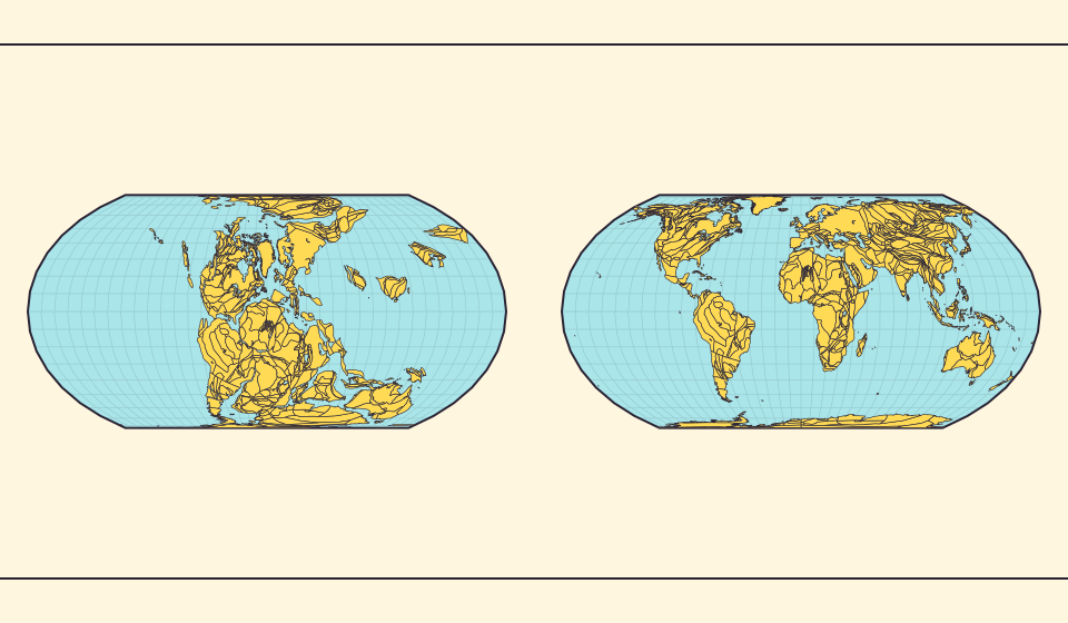
Pangaea was not there at the start of every timeline
At 600 million years ago, Pangaea had not yet assembled. Follow separated landmasses as they come together and later drift apart.
Leer la historia →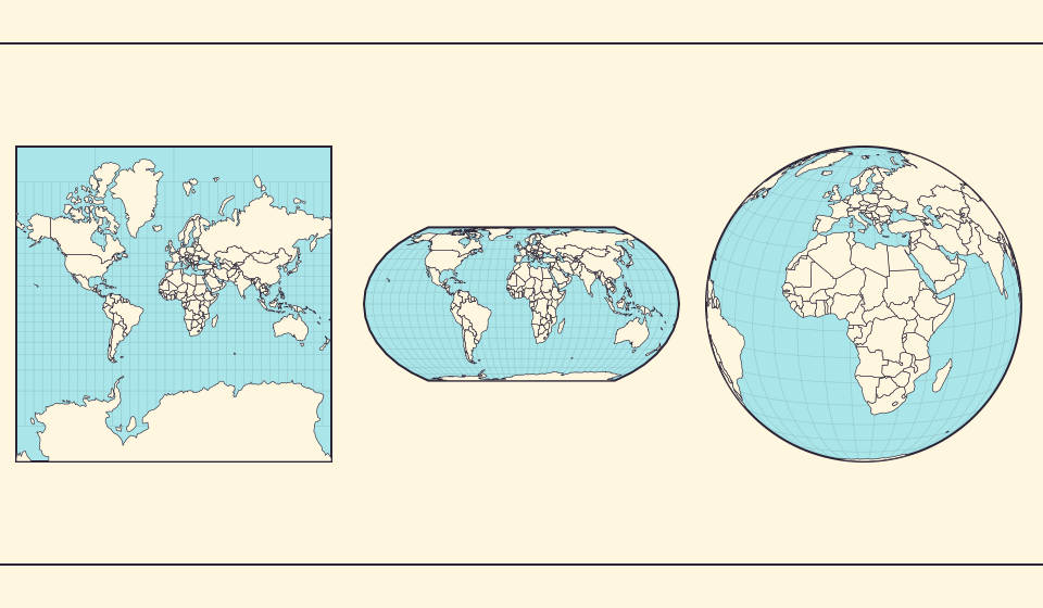
Five questions before sharing a “true world map”
Projection, zoom, viewpoint, source detail and the meaning of area all affect how you read a map. Check these before sharing a comparison screenshot.
Leer la historia →