This story is currently available in English and Korean. You are reading the English edition. 한국어 · English
Africa is bigger than the map in your memory
Picture Africa, then picture Greenland. Which seems larger, and by how much? A map learned at school can make that question feel easy even when the remembered proportions are misleading. Africa is a good place to begin because its outline spans the equator and invites comparisons with countries far to the north.
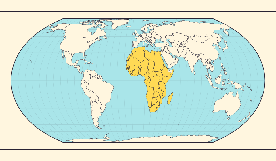
A continent of roughly thirty million square kilometres
IPCC’s 1997 regional assessment, hosted by the UN library, gives Africa’s land area as about 30.24 million square kilometres. For an introduction, roughly thirty million is a useful scale to remember. Exact continent totals vary with the treatment of surrounding islands and regional boundaries, so a long string of digits can imply more agreement than actually exists.
Keep that order of magnitude in mind while looking at the world. Africa is a continent containing many countries, not a single country to rank alongside them without explanation. When comparing a country with a continent, say clearly what you are comparing.
منابع: IPCC (1997) / UN Digital Library · Regional impacts: Africa
The missing space is relative
Mercator gives more map space to each unit of ground at high latitudes. When the whole world is fitted into one rectangle, Africa can therefore appear modest beside enlarged northern regions. Its outline has not necessarily been deliberately shrunk; the relative allocation of map space has changed.
Equal Earth preserves area ratios across the map, so the comparison looks different. Switch between the views. Which region seemed largest at first? Which stands out when the northern enlargement is removed?
منابع: USGS · Map Projections: A Working Manual (Snyder, 1987)
Build a comparison, not a packing claim
Choose a few countries you know well and move their outlines beside African regions in comparison mode. Familiar outlines give an abstract area a personal reference. Try one northern country and one near the equator; the difference between their original screen sizes becomes part of the experiment.
A visual collage is not proof that several countries fit perfectly inside a continent. Overlap, omitted islands, mismatched area definitions and the choice of rotation all affect such an image. Describe it as a scale illustration unless a reproducible geometric calculation establishes the stronger claim.
Read Africa around the equator
Bring Africa toward the center and find the equator. The continent extends into both hemispheres. Trace its broad northern outline and the narrowing shape to the south, then compare that silhouette with the long outline of Russia or the island of Greenland.
Now find Greenland in the same view. Mercator enlarges its high-latitude outline, while Equal Earth makes the area contrast with Africa easier to see. Compare your first guess with the two outlines at a shared scale to see how the map influenced that guess.
منابع: USGS · Map Projections: A Working Manual (Snyder, 1987)
Give Africa a familiar reference
- Select Greenland, India and Australia in comparison mode.
- Move the outlines toward African regions while keeping the zoom fixed.
- Open Equal Earth and compare the original positions again.
Compare the land footprint, then ask a separate question about distance or population. They are different measures.
بازکردن نقشه →
Common questions
Can I select Africa as one country?
Country search selects countries and territories. Use individual outlines for the experiment; the continent total comes from a separate geographic source.
Does the size of a continent explain travel time?
No. Area alone does not specify the endpoints, transport network or route of a journey.
Sources and further reading
Sources checked:
Related stories
Russia and Africa: width is not area
Russia stretches across the top of many world maps. Compare that visual width with area, and learn why a country and a continent need different labels.
چرا گرینلند اینقدر بزرگ دیده میشود؟
نقشههای مرکاتور نواحی نزدیک قطبها را کشیده نشان میدهند. به همین دلیل گرینلند در مقایسه با کشورهای نزدیک استوا بیش از اندازه بزرگ به نظر میرسد. گرینلند و استرالیا را در Equal Earth مقایسه کنید. نقشهٔ مناسب دریانوردی لزوماً برای مقایسهٔ مساحت مناسب نیست.
Equal Earth چه چیزی را حفظ میکند؟
تبدیل کره به صفحه برخی ویژگیها را تغییر میدهد. Equal Earth مساحتهای نسبی را حفظ میکند، نه همهٔ شکلها، فاصلهها و جهتها را. در لبهٔ کره شکلها فشرده میشوند. نمایش را متناسب با پرسش خود انتخاب کنید.